Budweiser Repackaging
Project Scope
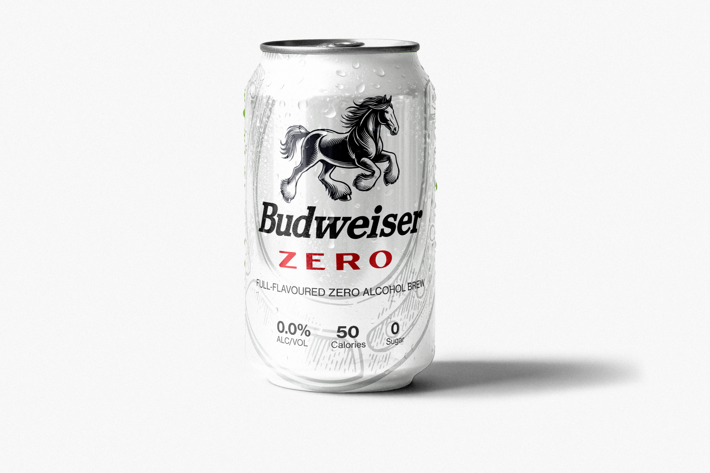
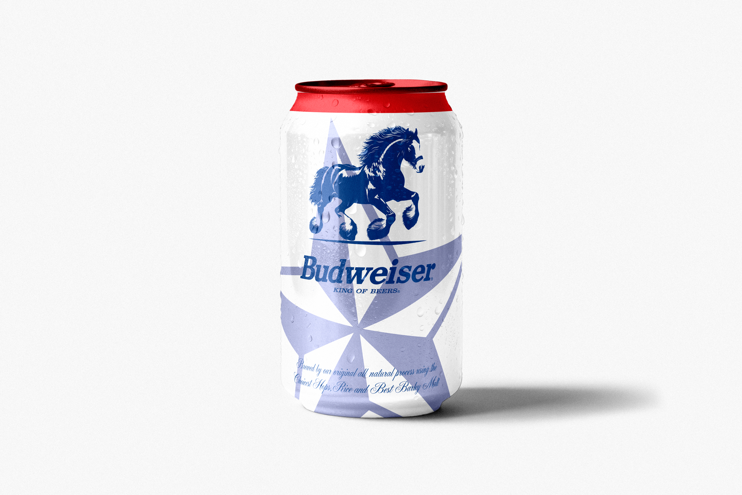
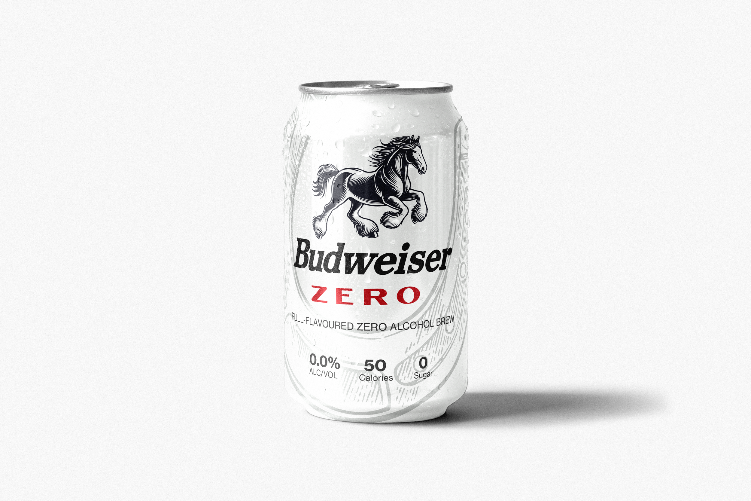
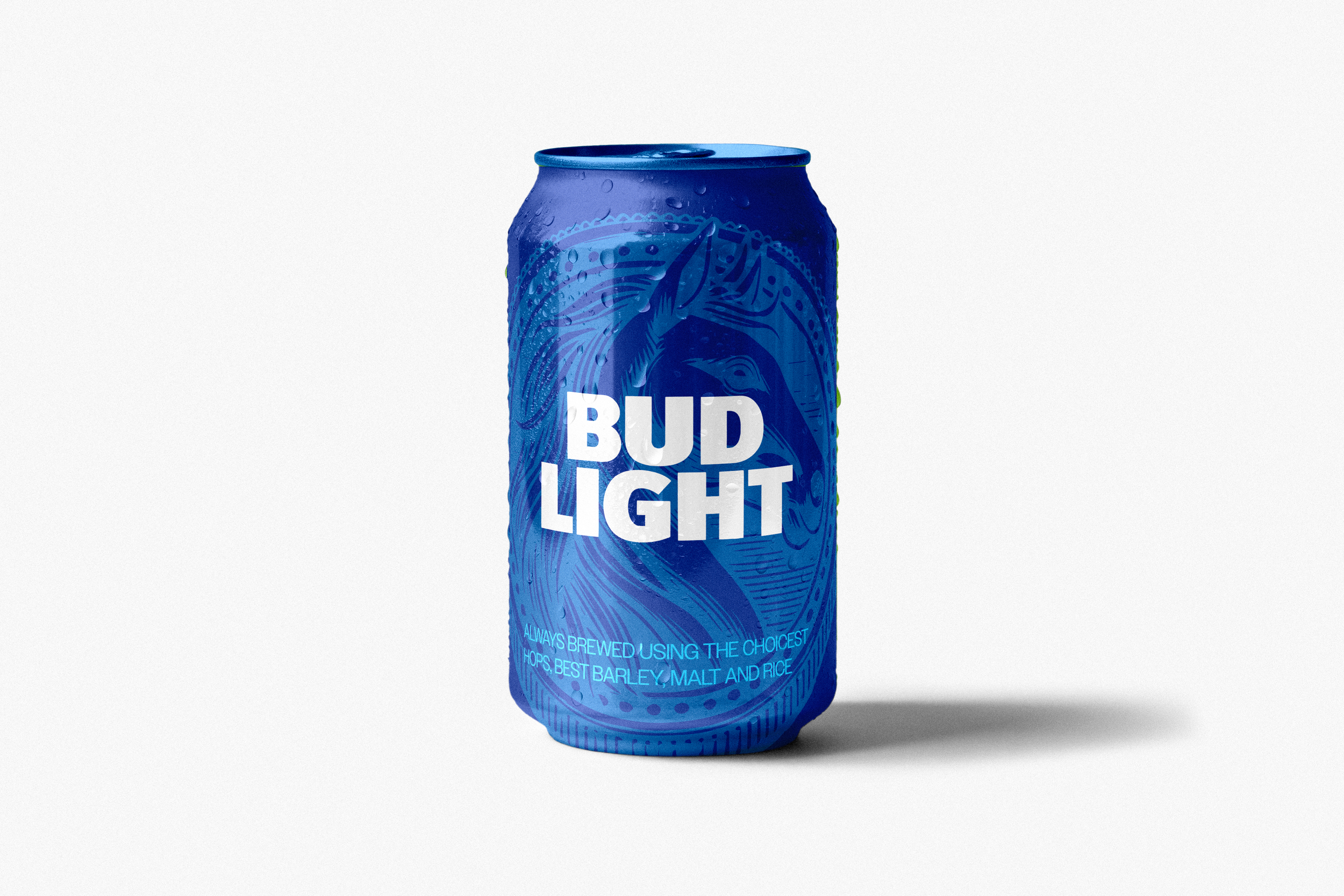
The objective of this project was to redesign Budweiser's packaging system across multiple products while maintaining strong brand recognition. The redesign aimed to modernize the visual identity, improve shelf impact, and create a cohesive family of products without losing the brand's historic character.
Research
The research focused on understanding Budweiser's long-standing visual identity and how it has evolved over time. Historical packaging, advertising, and brand assets were analyzed to identify the elements that have remained consistent throughout the brand's history. Particular attention was given to the iconic Clydesdale horse, the Budweiser wordmark, and the signature red, white, and blue color palette, as these are central to the brand's recognition and heritage.
Challenge
The primary challenge was modernizing the packaging without losing the heritage that makes Budweiser instantly recognizable. As one of the world's most established beer brands, any redesign needed to respect its history while appealing to a new generation of consumers.